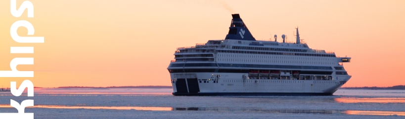
IMO 9226906
Built 2005, Fincantieri Porto Maghera, Italy
Tonnage 82 972 GT
Length 285,30 m
Width 32,20 m
Draugth 7,80 m
2 556 passengers
5 Wärtsilä diesels, combined 51 840 kW
2 azipods
3 bow thrusters
Speed 22 knots
As P&O Cruises last week made public their plan to alter their traditional livey, that has been in use since the arrival of the Strathnaver in 1931, I thought it a good moment to look at a P&O Cruises ship still in the current livery. Namely the Arcadia, the history of which was (albiet briefly) covered in an earlier entry.
It will perhaps not come as a surprise to anyone that I quite live the current P&O livery. I'm not normally a fan of all-white hulls and superstructures, but P&O pull it off rather well. A major contributor to this are of course the stylish buff (yellow) funnels that function as an attractive counterpoint, creating a very balanced whole (admittedly this is less true with the Princess Cruises -derivatives Azura and Ventura, due to their different funnel design).
The new P&O livery, on the other hand, has none of the uniqueness of the current livery. You can see the new colours for instance at MaritimeMatters here. Dark blue funnels are fast becoming the new industry norm - and I understand the appeal, as the colour is very nautical. But have you noticed how many passenger shipping companies have during the last half a decade have opted for blue funnels and/or hulls? The recognisability of the hue is quickly becoming eroded - something that is not a problem with the current funnels. And the Union Flag on the hull seems very much like pandering to the nationalist elements currently on the rise in Europe. P&O is already a British Institution. There is no need to further emphasise that by such a blatantly jingoistic element.
Overall, the new livery also has the problem, as pointed out by other observers, that it is quite similar to that of Norwegian Cruise Line: dark blue funnels with hull art at the bow. Certainly the impression I have thus far held of P&O is quite different from my impression of NCL. I also have to say that, as a purely personal note, the new P&O livery actually makes me want to sail with them less. For years, the company has been on my "bucket list", but I'm finding their product less and less appealing. Certainly the change of livery is not the only thing contributing to this, but even so - and I admit this is entirely irrational - the blue-funneled P&O seems a lot less appealing to me than the yellow-funneled P&O.
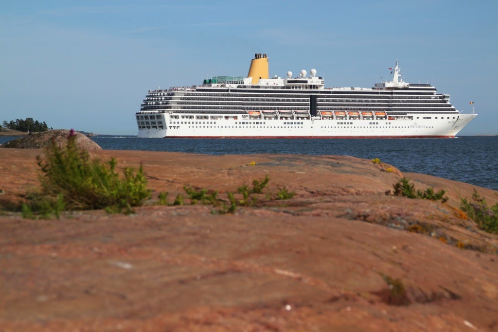
Rant aside and onwards to the point: The photographs below show P&O's Arcadia departing from Helsinki West Harbour in the evening of 28 June 2013. Photographed from Sisä-Hattu. Click on the images to see them in larger size.
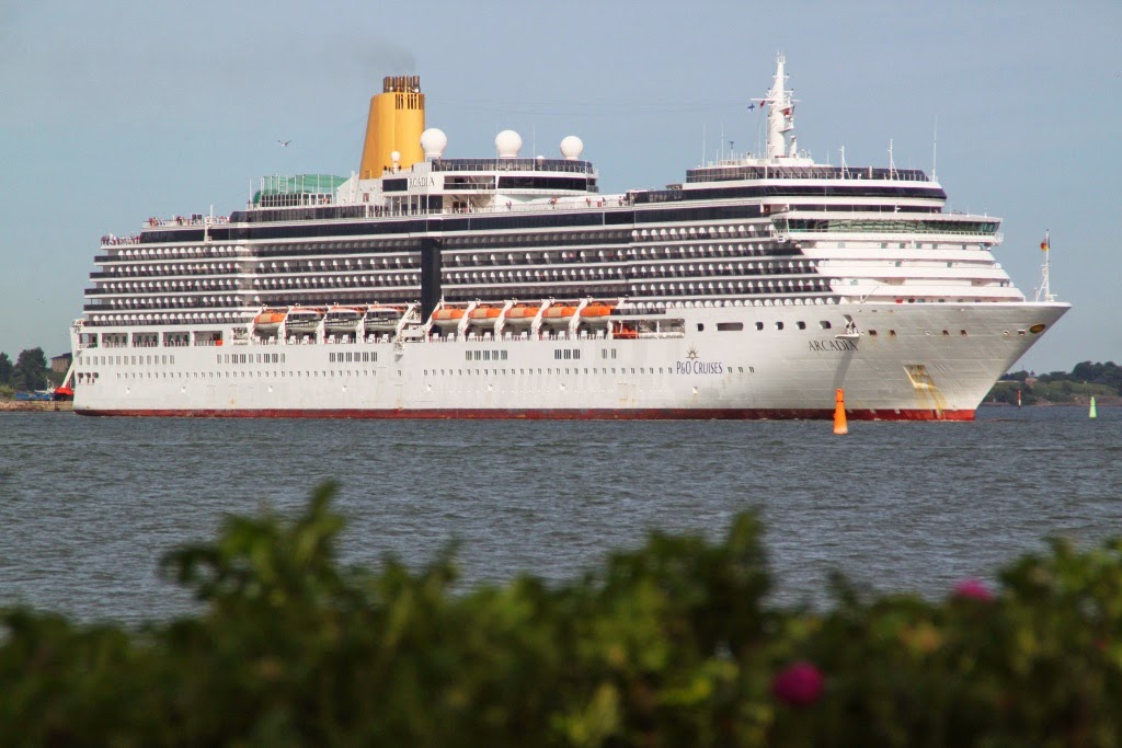 |
| I've always been a fan of the Vista-class and its pleasant simple lines. The Arcadia looks particularly good with her simple livery balancing the good looks of the ship. The dark window stripes of the top decks also work splendidly on her. |
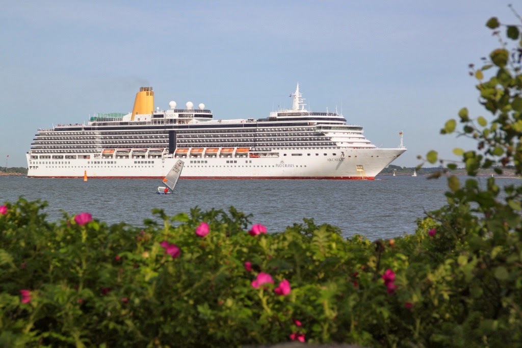 |
| The return of the bush of japanese roses in the foreground. |
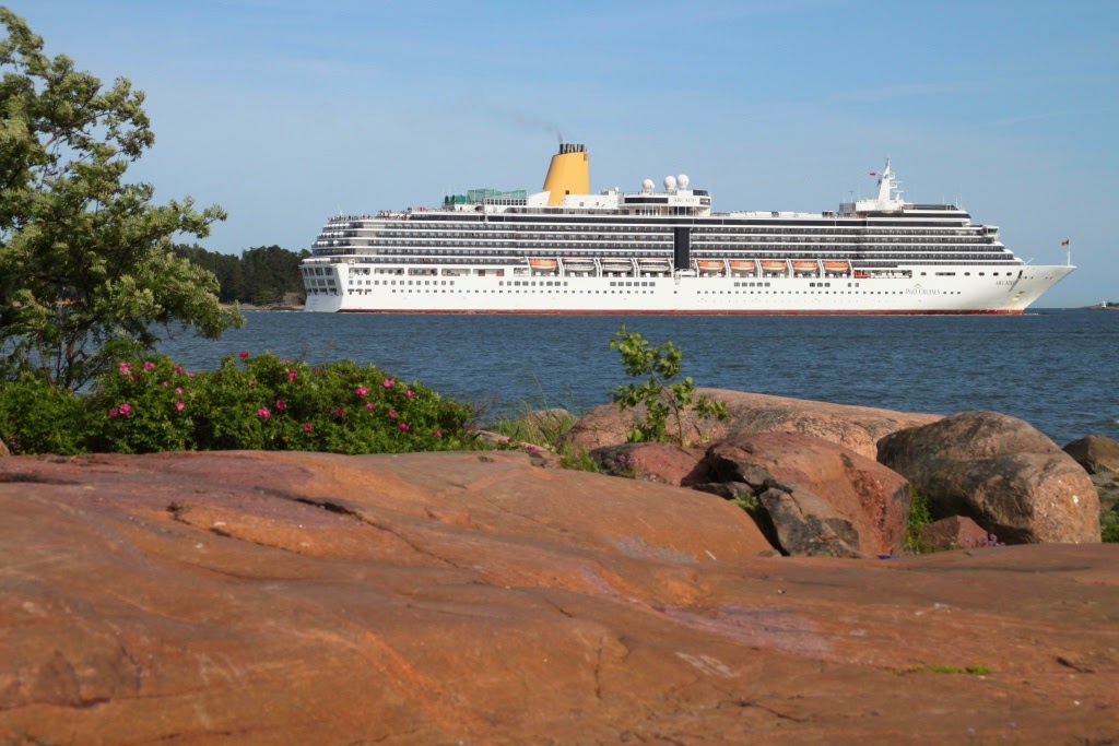 |
| Finnish granite, part 1. |
 |
| Finnish granite, part 2. I really, really like this shot. |
 |
| And some more Finnish granite, now in a boldery form. |
No comments:
Post a Comment