As those following the blog undoubtedly observed, last week's entries were dedicated to ships of the
R-class. Since the
R ships are operated by numerous different companies, the photographs of
R-class ships give a good opportunity to look at how different liveries look on ships of the same design.
Before we go further, here are links to all
R-class ships featured on this blog:
Columbus 2 (ex-
R One)
Regatta (ex-
R Two)
Ocean Princess (ex-
R Four)
Nautica (ex-
R Five)
Azamara Journey (ex-
R Six)
Blue Moon (ex-
R Seven)
Originally all the
R-class ships were, of course, painted in Renaissance Cruises' livery with a dark hull and a white funnel (which, looking at it now, looked very 80s). Alas, I do not have any photos of the original livery, but when Pullmantur Cruises used three of the
R ships in the mid-00s they only did basic modifications to the livery, so our example here will be the
Blue Moon.
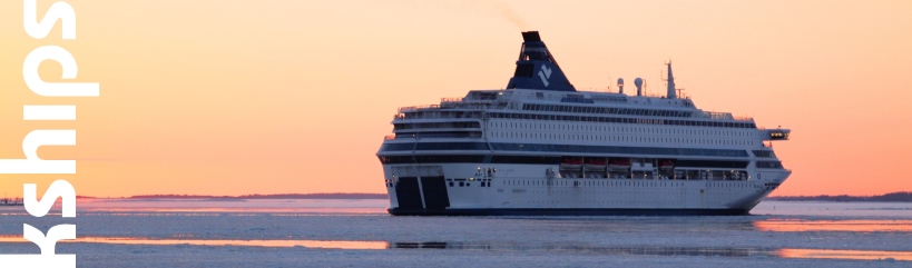
 |
| Now just mentally block out the Pullmantur Cruises hull text and replace the globe logo on the funnel with the letter R and you essentially have the original livery. Blue Moon in Helsinki, 29 July 2007. |
Now I must admit that I'm not a huge fan of the original livery. The black comes very high on the hull and makes the ship look quite unbalanced. For their subsequent owners all the
R ships have been repainted with white hulls, but with subtle differences to the exact liveries. Let us start from the ship with the most basic livery, the
Ocean Princess.
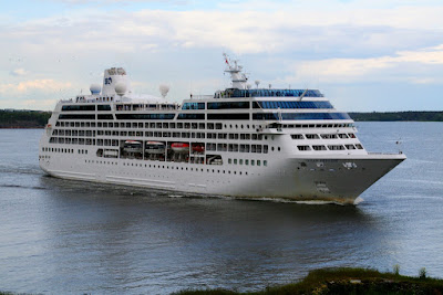 |
| Admittedly this photo does not nescessarily do the ship justice due to the poor lighting, but it will have to do. Ocean Princess in Helsinki, 12 June 1012. |
Princess Cruises' ships are traditionally all-white. This worked (relatively) well back in the days of the ships like the
Island Princess (present-day
Discovery) which had shape and detail on themselves. But on ships like the
Ocean Princess... well, let us compare her with her sister ships and you can judge for yourselves. Or more to the point, read my judgement.
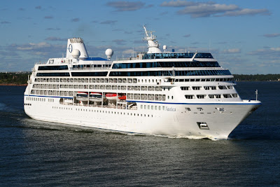 |
| Nautica in Helsinki, 20 June 1012. |
Oceania Cruises'
Nautica is not all that different from the
Ocean Princess. Both ships are predominantly white and both have white funnels with blue logos. The major difference is the simple addition of a blue stripe along the top of the hull (and the ship's name painted in a different location on the bow). A small change, but a large improvement in the ship's appearance.
 |
| Azamara Journey in Helsinki, 15 June 2012. |
Azamara Cruises was originally extablished in essence to compete with Oceania Cruises and originally the company livery was almost indistinguishable from that of Oceania. However, in 2010 Azamara Cruises was rebranded as Azamara Club Cruises and given a new, more colourful logo as seen in the photo above. Again, the changes from the
Nautica to
Azamara Journey are not extensive. The hull stripe is a lighter shade, but more importantly the Azamara logo is more colourful, which improves the appearance of the funnel immensely. Furthermore the company name and logo are also painted on the hull, giving a further, refreshing splash of colour. As a final improved touch, the frames of the bridge windows have been painted black, making the ship look more modern and linking the bridge structure betetr to the decks above it. Certainly of the trio
Ocean Princess, Nautica and
Azamara Journey the latter is (in my opinion) by far the best-looking one. But there is still one more ship to look at: the
Columbus 2.
 |
| Again, the lighting is not perhaps entirely fair in comparison with the other ships. Columbus 2 in Helsinki, 27 June 2012. |
Hapag-Lloyd Cruises took the
Columbus 2 under charter earlier this year from Oceania Cruises (the ship was previously Oceania's
Insignia). Hapag-Lloyd's traditional blue and orange hull stripes were archieved by simply painting an orange stripe below the existing Oceania Cruises blue one. That in itself is, in my opinion already an improvement over the Oceania livery. But where the Hapag-Lloyd livery really comes on it's own and tremendously improves the ship is the funnel. White funnels are a fetish to modern ship owners, but (in my opinion anyway) they almost always look bad. White is the colour you use if you're an unskilled graphic designer afraid of filling out the white paper in front of you. On the other hand, the
Columbus 2 does lack the
Azamara Journey's sleekening bridge windows paint.
So, what is the best livery of the ships featured here? My vote goes to either the
Azamara Journey or the
Columbus 2 - both are good but in slightly different ways. The former has more vibrant logos (plus a logo on the hull, an improvement in my opinion) and the painted window frames on the bridge, while the latter has a coloured funnel and more colour on the hull stripes. Add the dark bridge window frames to the
Columbus 2 however, and you would have a definite winner.


No comments:
Post a Comment